Branded Balloon Columns can turn a campaign name into a repeated visual feature across an exhibition, office celebration or retail promotion. The important decision is what should stay consistent from one column to the next. A logo on a large topper, a recognisable colour combination and a short event message perform different jobs. Planning them as a set helps each installation feel connected, even when the columns stand in separate areas. These examples explore how to develop that repeated identity, including when a plain topper can be more effective than another printed message.

Branded Balloon Columns need one clear identity at the top
Start by deciding whether the display represents the company, a particular campaign or a named event. Those are not always the same thing. An exhibition column might carry the company logo because visitors are searching for the stand. An internal celebration may need the event name because everyone already recognises the employer. Trying to give all three messages equal prominence can leave the topper with no clear purpose. Choose the primary identity first, then decide which supporting information belongs elsewhere.
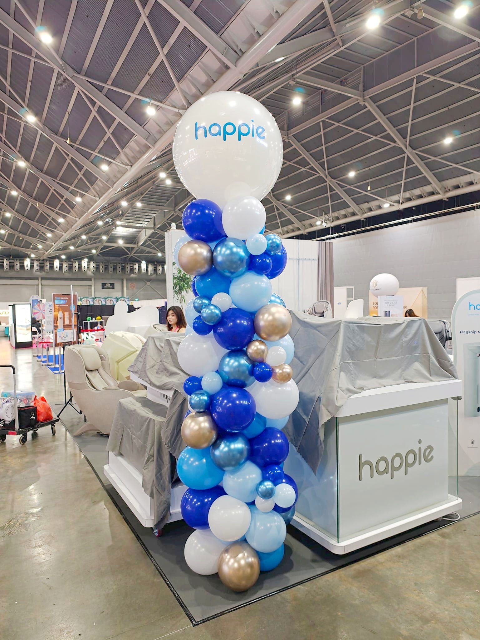
The exhibition example pairs a white printed topper with a blue, white and gold column. The topper acts as a recognisable marker above the counter, while the surrounding balloon colours connect it to the display below. THAT Balloons’ advertising balloon pillars page is a useful service reference when discussing this arrangement. Ask which topper materials and printing options are available for the proposed design; a photograph does not establish the specification or price of a new order.
Approve the message once before repeating it
A repeated installation makes inconsistencies more noticeable. If four columns are intended to carry the same wording, approve one master version with the correct event name, capitalisation and year. Use that approved version across the set rather than retyping the message for each position. A small spelling difference that is easy to overlook in separate files can become obvious when the columns are photographed together. The same applies to outdated dates or an older version of a company logo.
The yellow and green set below uses the same short message on four white toppers. Its strength is repetition: the words do not have to explain the entire programme. Keep detailed schedules, participation instructions and contact information on suitable supporting signs. Before production, review the complete set of artwork files together and identify which columns are identical. If some versions are intentionally different, label them clearly so the installation team can match each one to its intended location.

Treat the balloon colours as part of the identity
Brand recognition does not depend entirely on print. Repeating the same colour combination can connect displays even when a visitor cannot read the topper. The green and white example below uses a coordinated palette beneath printed silver stars. The navy, white and black set in the gallery offers another approach, with repeated names on pale toppers. Think about the balance of colours across the whole installation. A small dark accent among mostly pale balloons reads differently from a predominantly dark column, even when both use the same palette.
Provide brand colour references when enquiring, then discuss the available balloon colours and finishes with the decorator. Do not assume a colour on a phone screen will match a physical balloon under warm venue lighting. The aim is a considered visual relationship, with any limitations understood before approval. Where an exact corporate colour is essential, ask which printed elements can carry it accurately and which balloon shades will be used to complement it. Keep the agreed selection consistent across all positions.

Give each brand a fair place in a shared display
A multi-brand event needs a slightly different approach. In the vehicle-brand example, each pair has its own logo and colour treatment, while the overall column format stays related. This makes the individual identities easy to distinguish without making the collection feel random. The useful question is not simply whether every logo fits. It is whether each identity has the prominence agreed by the organiser and whether guests can tell which display belongs to which brand.
Review the logos as a group at their intended visual scale. A wide wordmark and a compact symbol can look very different even when placed inside equally sized artwork boxes. Ask the designer to check their apparent weight rather than mechanically making every file the same width. Confirm brand approvals and the allocation of each pair before production. Keep a location list with the final artwork so that a correctly printed topper does not end up on another brand’s colour combination.

Separate a promotion headline from its detailed offer
The Black Friday example uses a short white headline against a black topper, with the detailed retail information displayed beside it. This division gives the balloon a clear promotional role without asking it to function as a full sales poster. For your own campaign, decide which phrase should be recognised first. A brief occasion name can work as a visual signal while the shop’s normal signage explains products, prices and conditions.
Avoid treating the wording visible in an older event photograph as a current offer. Develop a fresh approved message for the actual promotion and check the dates separately. If custom printing is required, the custom printed balloons service page provides another relevant starting point. Confirm the printable area and suitable artwork format with the supplier before compressing a large design into a topper. A short approved line is often easier to recognise than several competing messages.

Lettered stars can identify an event without a round printed topper
The blue star example carries an event abbreviation and year on matching toppers. It shows that a repeated identity can use a different silhouette while retaining a consistent message. Consider whether the full event name is already visible nearby. An abbreviation may be appropriate for an audience who knows it, but it should not make unfamiliar visitors guess what the display represents. Check the wording in the context of the other signs, rather than reviewing the balloon artwork alone.

Decide where printing adds value and where colour is enough
For further examples of column formats, see Balloon Shop’s balloon pillars decoration service. The gallery compares plain toppers, columns beside an existing wall logo, themed star displays and a milestone-number arrangement. These are useful alternatives when planning a branded set. A strong wall sign may already identify the venue or business, allowing the balloons to provide colour and emphasis. A repeated plain topper can also keep the display visually connected without adding another block of text. Numbers and decorative shapes serve a different purpose again: they identify the occasion rather than the company.


Build a practical approval sheet for the complete set
Bring the chosen topper style, approved wording, logo files, balloon palette and location list into one document. State how many columns share each artwork version and identify any intentional exceptions. Include a photograph of the surrounding sign or counter when it affects how the branding will be seen. Ask the decorator to confirm production details, installation requirements and what is included in the quotation. Branded Balloon Columns work best when the repeated elements are deliberate: one clear identity, a consistent visual treatment and the right amount of information for each display.